
After doing some research, the next step in my logo creation process was brainstorming my own ideas. I started by making a list of all the things I would be doing as part of NC Machine Works and jotting down key visual items related to those activities. ![]() Coming up with the name NC Machine Works was difficult as I wanted to keep it generic as there are a number of fields I want to get into. Completing this list re-enforced the fact that designing a logo would be equally difficult for the same reasons. For example I didn’t want to have a logo that showcased a woodworking tool as it would exclude my efforts in metalworking and electronics. As I had already chosen a name this ruled out any animal logos. A company such as Geckodrive Motor Controls can have a gecko as their logo as it is built into their company name. If NCMW were to have a tiger as a logo it would be confusing as to what a tiger would have to do with anything.
Coming up with the name NC Machine Works was difficult as I wanted to keep it generic as there are a number of fields I want to get into. Completing this list re-enforced the fact that designing a logo would be equally difficult for the same reasons. For example I didn’t want to have a logo that showcased a woodworking tool as it would exclude my efforts in metalworking and electronics. As I had already chosen a name this ruled out any animal logos. A company such as Geckodrive Motor Controls can have a gecko as their logo as it is built into their company name. If NCMW were to have a tiger as a logo it would be confusing as to what a tiger would have to do with anything.
To make things harder I defined two requirements based on where I plan on using the logo.
- It must be effective at all sizes. I will be putting the graphic portion on circuit boards and other small parts and it must be simple enough that it is clear and recognizable at a small scale. The full logo with graphic and text will be included in webpage headers, business cards etc.
- It must be colour neutral and keep shaded areas to a minimum (line art). The logo should be reproducible by engraving, laser cutting and stamping so simple lines are best. A sans-serif font is a must.
Using my list I started sketching out ideas. I am not a great drawer but using pencil and paper was the quickest way to get ideas down and get a feel for how they work. I wasn’t interesting in getting it perfect but to determine which concepts were worth hashing out in more detail.
![]()
![]() In addition to sketching logos I browsed through the collection of google fonts and noted a few that could be useful typesets to use in the logo. The first logo style I explored was based on the FITS framed design, the font Biome extra wide from the AVIVO logo and the stamp like feel from the Donas Soder logo. I played around with the spacing, line widths and accompanying text styles. From this point on I sketched the logos in Rhino 3D which allowed me to make copies to explore variations and easily adjust the scale and line widths.
In addition to sketching logos I browsed through the collection of google fonts and noted a few that could be useful typesets to use in the logo. The first logo style I explored was based on the FITS framed design, the font Biome extra wide from the AVIVO logo and the stamp like feel from the Donas Soder logo. I played around with the spacing, line widths and accompanying text styles. From this point on I sketched the logos in Rhino 3D which allowed me to make copies to explore variations and easily adjust the scale and line widths. The next thing I tried was replacing the ‘C’ with a torx head for more of a gimmicky look. Changing the rotation of the image gave the logo a different feel.
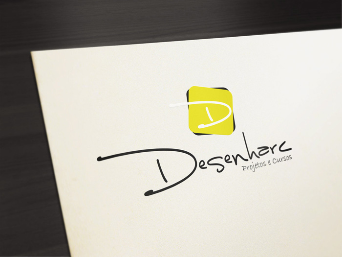
 The next idea I developed was an angled logo based on the ones I made previously. This idea was inspired by the Desenharc logo and the construction lines in the EDKA logo.
  After these logos I changed direction and created a series of designs based on encoders.
  I tried several ways of incorporating a honey comb pattern into the logo but with little success. (Since doing these sketches I learnt about the New York Times R&D Lab via The Amp Hour podcast. The NYT R&D lab has a honey comb logo similar to the first one I sketched)
  The next idea I tried was electronic component footprints of a SOIC8 package.
  I tried shield logos with different shield sizes, crests and name placement.
  The spiral logos look like an imitation of the boundary logo but they were meant to represent a spiralling cut on a lathe. This proved to be impossible with my skill set and the level of detail I used. I think it could be done using some cleaver shading but that didn’t meet the requirements I set out for the logo.
  Using an abbreviation for the word Machinery let the words stack up nicely.
 I really liked the realator.ca logo and how it looked like extruded wire. The screwdrivers and lathes below were created in this style.
  Wanting to try a logo that focused on 3D printing I came across the google font Montserrat Subrayada that lent itself to depicting an extruder.
  This 3D logo is based on the helicopter logo in the Ideabook.com tutorial. If I were to develop this one more I would add some chips flying around.
 ![]() The last set of logos I developed were screwdrivers based on the ones I made wire art, I tried making these in 3D and simplifying the shapes as much as possible.
The last set of logos I developed were screwdrivers based on the ones I made wire art, I tried making these in 3D and simplifying the shapes as much as possible.  In total I generated around 70 different logo designs from roughly 15 different themes. These were concept sketches and none of them were ready to be the final logo. From this collection I created a short list of 29 designs that I would evaluate in more detail.

Short List of Logo Designs