I’ve started to get into PCB design as part of the electronics hobby and have been looking around for ideas on board layout, footprints and artwork to make my PCBs look as professional as possible. This post will focus on PBC artwork and is a compilation of examples I’ve found while doing research online. PCB artwork got on my radar after reading a dangerous prototypes post featuring the beautiful artwork below. After looking at numerous examples of hobbyist and professional boards I’ve broken down PCB artwork into three categories: background art, logos and information. Overall these features can be either functional or aesthetic but greatly add to the overall professional appearance of the board.

http://dangerousprototypes.com/2012/08/29/dithered-images-on-the-pcbs-silk-layer-update/
Before getting into examples it is important to understand what canvas a PCB designer has to work with. For a typical board made at a profession fab house or by a hobbyist with a good set-up there are four palettes to work with:
- Exposed traces and pads – Copper, tin or gold
- Solder mask with ground pour beneath – Historically green but all colours can be found including purple, blue and black to name a few
- Solder mask with copper removed below – Areas where the copper has been removed below will come out significantly darker than those with copper beneath
- Silk screen – Typical white. While the cheap hobbyist board fabs will only do one silk screen it is possible to have many colour layers added (at a price) such as this example via The Amp Hour.
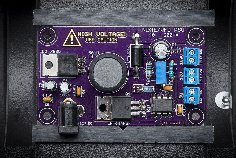
A great example that uses all four colours available is this adjustable boost converter by johnengineer. This board has the OSH Park purple solder mask as a background, white silk screen for the board name and component designations, a HIGH VOLTAGE warning in the exposed ENIG gold finish and the bare solder mask with an almost back colour around the text providing great contrast between the gold and purple. Also of note is the designer’s initials and date on the board written by removing the copper around the letters under the silk screen.
http://www.flickr.com/photos/johngineer/10803583634/in/pool-oshpark
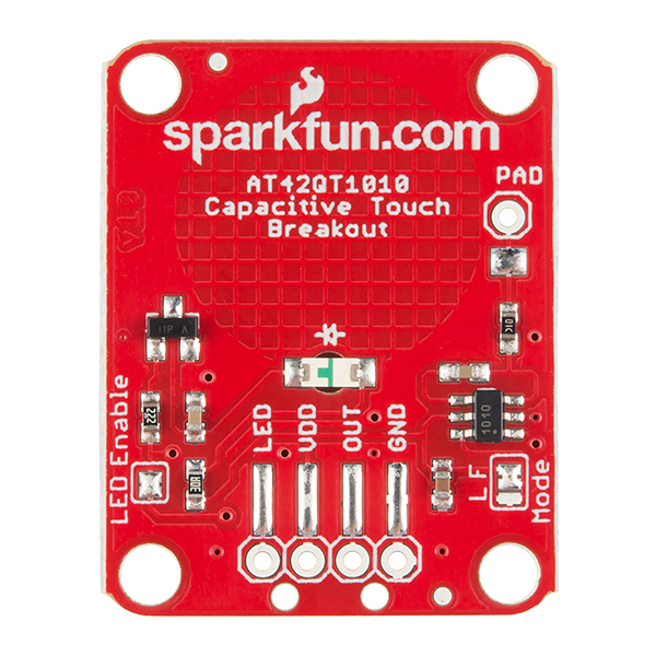
The Sparkfun.com capacitive breakout board below provides another clear example of the difference in solder mask colour with and without copper underneath.
https://www.sparkfun.com/products/12041
Another trick that can be used to get a different look from the same four colours is to invert the usual order of soldermask with silkscreen writing. I am quite fond of the new Arduino boards with a white silkscreen background and blue solder mask text.

Back side of an Arduino Leonardo
Logos
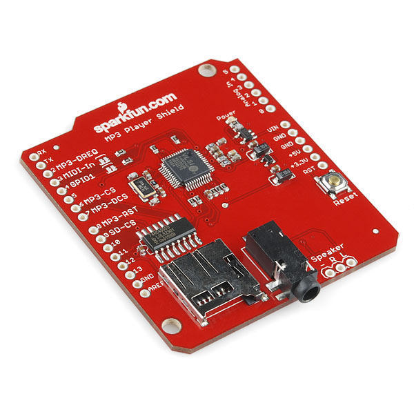
I was mostly interested in logos when I started reviewing board designs. When it comes to branding a pcb with a clean and recognisable logo I see SparkFun as the gold standard. Below is their MP3 Player Shield with their full logo and board name underneath. Between the distinctive colour and clean branding you can instantly tell this to be a Sparkfun board.
https://www.sparkfun.com/products/10628
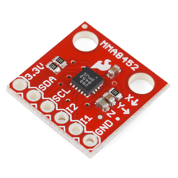
The great thing about Sparkfun’s logo is that flame can stand on its own when the board size doesn’t provide room for the text. Below is a 3-axis accelerometer breakout board which maintains the clear branding even though the board is smaller than a quarter.
https://www.sparkfun.com/products/10955
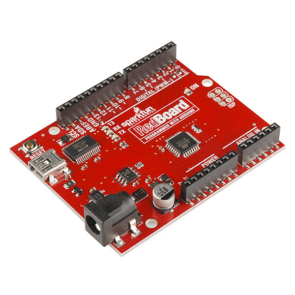
Their Red Board (modified Arduino Uno) goes a bit further having the company logo and featuring the board title with enhanced artwork.
https://www.sparkfun.com/products/11575
On the subject of Arduino variants, I like what Make has done with their SMD Arduino Uno. The artwork is very similar to a regular Uno but with a few silkscreen accents with a graph paper like design and a sharp looking Make robot on the back.
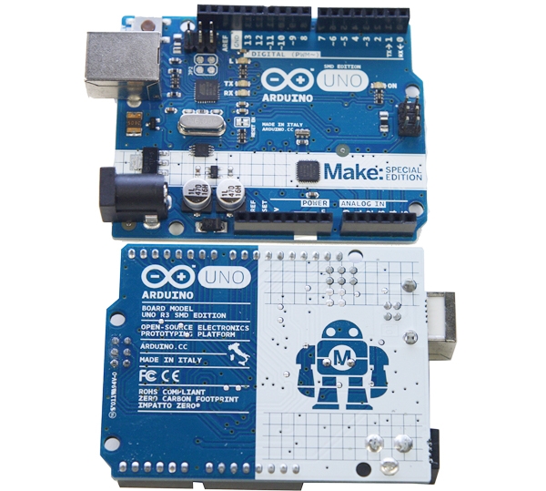 http://www.makershed.com/Arduino_Uno_Rev_3_Make_SMD_Version_p/mksp99.htm
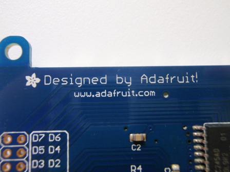
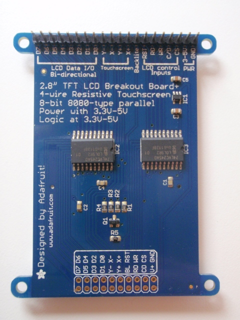
When it comes to logos they don’t always have to be over the top. The next picture is from Adafruit’s 2.8″ TFT breakout board sitting on my bench with a simple “Designed by Adafruit!”, their web address and flower logo.
A really good resource for board designs is OSH Park’s recently launch Shared Projects where users that have had their boards made through OSH Park can upload their designs for others to view. Going through over 220 pages and roughly 1000 boards I was able to get ideas and see which design elements I like and don’t like. The following are a few examples that stood out on the logo front.
http://oshpark.com/shared_projects/8bitR8hD
http://oshpark.com/shared_projects/m3sqStxs
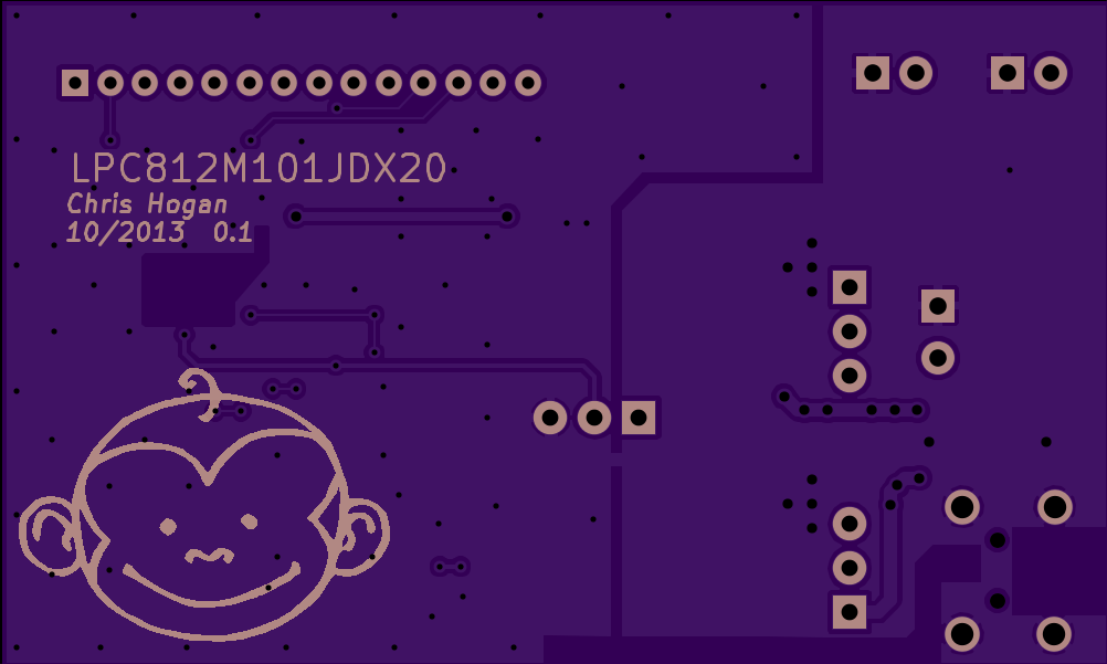
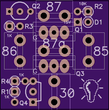
Chris Hogan and Animo both have a few boards under the shared projects and their monkey and lightbulb logos made them instantly recognisable and provided brand recognition as I was flipping though that pages that made them stand out.
The scale involved with pcb logos doesn’t allow a ton of detail. Simple shapes such as the Rocket Mega and tomflock.com logos below are sure to come out cleanly in the silkscreen.
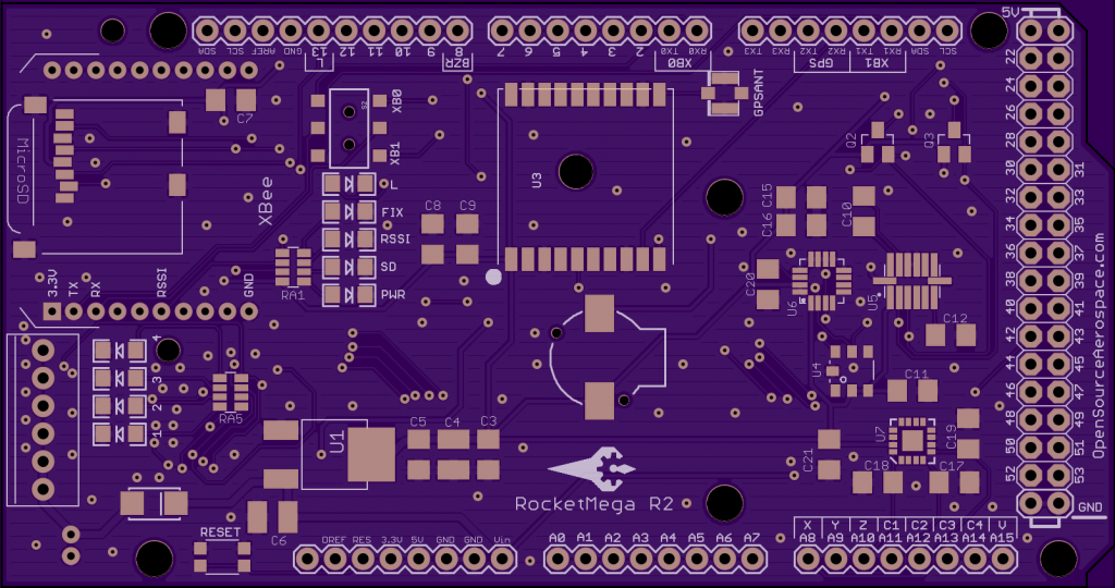
http://oshpark.com/shared_projects/MxMFXXUg
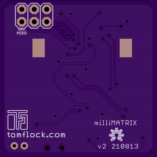
http://oshpark.com/shared_projects/x2C2WcQu
Brian Schmalz’s logo caught my eye as it uses standard looking SMD pads as the windows for the house.
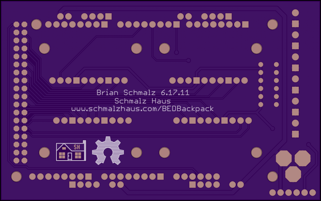
http://oshpark.com/shared_projects/hQJ7GQCm
Lastly jmedved.com’s polar bear logo is a nice clean design with the coper pour pulled back around the exposed ENEG finish to increase the contrast as in the johnenginner example at the top.
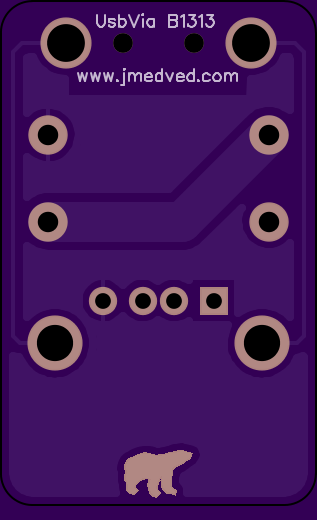
http://oshpark.com/shared_projects/4KNRuADu
Information
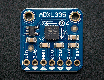
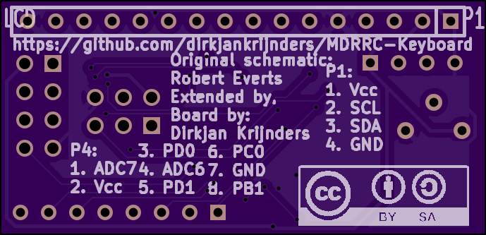
Providing information on the PCB can make a board much more user friendly and avoid constant cross referencing to the design files. In a small amount of space Adafruit manages to convey the name of the chip on the breakout board, the correct orientation of the board to the accelerometer’s axes, the name of each pin going off the board and the direction of the information flow.
http://www.adafruit.com/products/163
Felix Rusu provides important warning information on his SwitchMote Proto Gen3 board while making the board look very professional in the process.
http://www.flickr.com/photos/15304611@N03/11525081984/in/pool-oshpark
This is the back of Adafruit’s 2.8″ TFT breakout again. If the space is available why not label each pin/ groups of pins and provide other useful information?
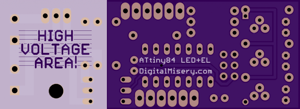
I really like the use of silkscreen to divide this board between high voltage and logic level voltage sections.
http://oshpark.com/shared_projects/l6QU5KWs
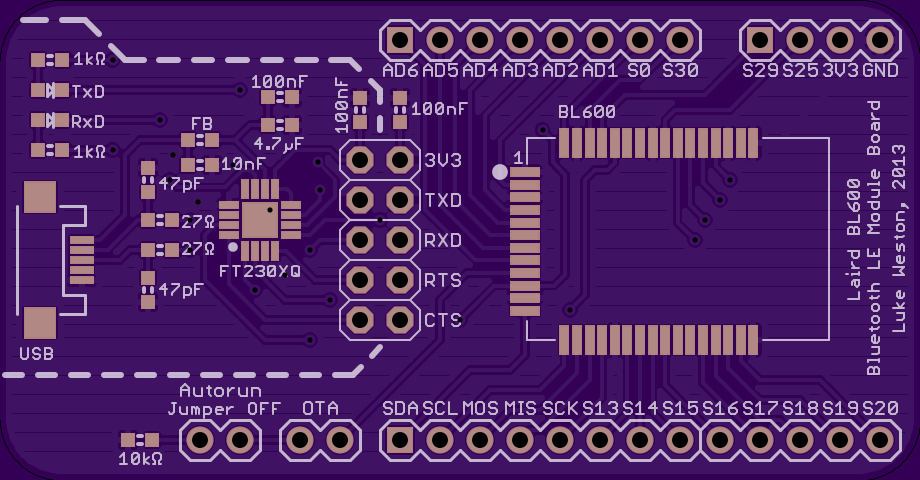
Similarly I like the use of a dashed line to indicate the regions running off of 5V supplied over USB vs the 3.3v supply for the bluetooth module on this board. I assume any signals crossing the dashed line are transmitted using opto isolators.
http://oshpark.com/shared_projects/PFtPEtJ6
Something I liked the look of but couldn’t find a great example of is using silkscreen to highlight important signal lines. This could be very useful for debugging. (I don’t believe the silkscreen traces below align with the coper traces)

http://oshpark.com/shared_projects/XDNLoePV
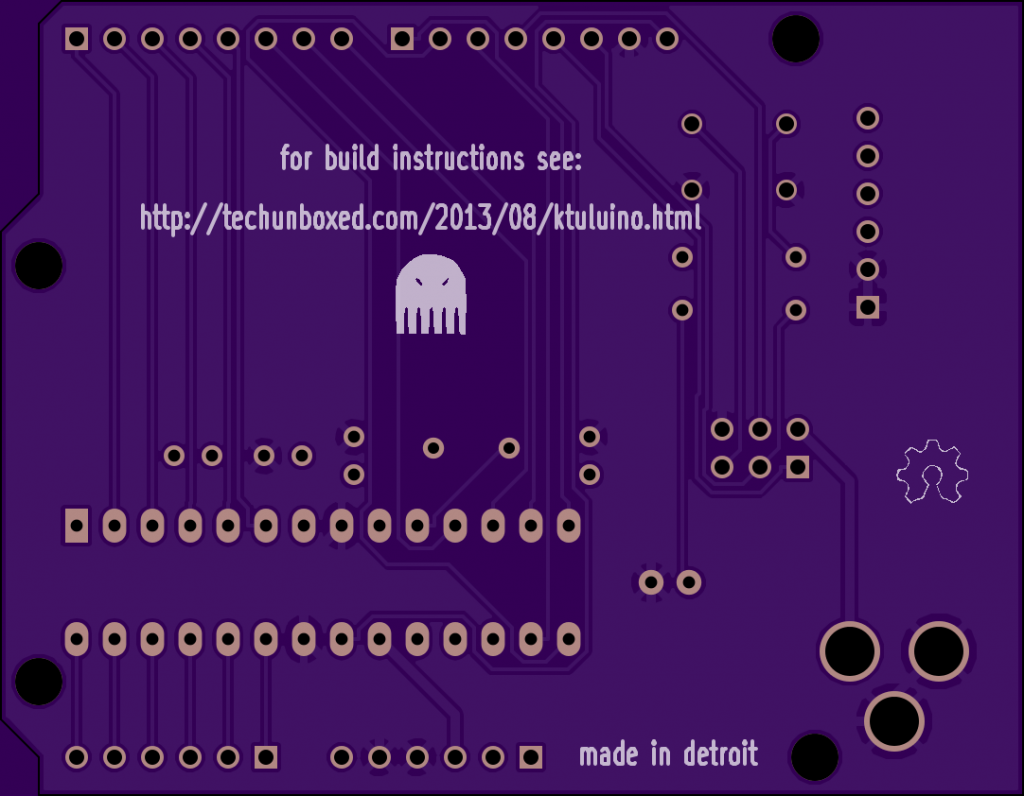
When space isn’t available on the board a simple url can be added to direct the user to the correct location.
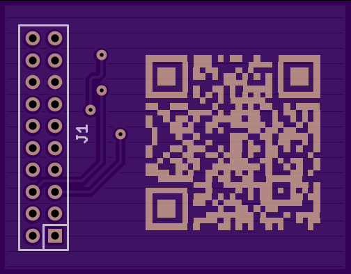
A neat idea I found was to use QR codes to communicate information. These can link to websites or e-mails using much less space than text. I think I’ll be making liberal use of QR codes on my boards in the future.
http://oshpark.com/shared_projects/bCWadXaR
http://oshpark.com/shared_projects/XrOiaET6
Licences
As I will be releasing my work under an open source licence (which one is still to be determined) it was interesting to see different takes on how to present the chosen licence.
A create commons Attribution-ShareAlike licence with text and proper presentation.
http://oshpark.com/shared_projects/z1GKYav9
The same licence without text (does this format preserve the licence? I don’t know)
http://oshpark.com/shared_projects/mxdfKfV6
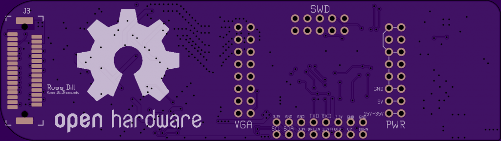
An Open Hardware logo front and centre. Elsewhere on this page are numerous examples of more discrete OSHW logos.
http://oshpark.com/shared_projects/pVWHM2hA
Background Art
Time to get onto the good stuff: background art. The Haduino has a nice solid Hackaday logo on the front and a pixilated background mask on the back.
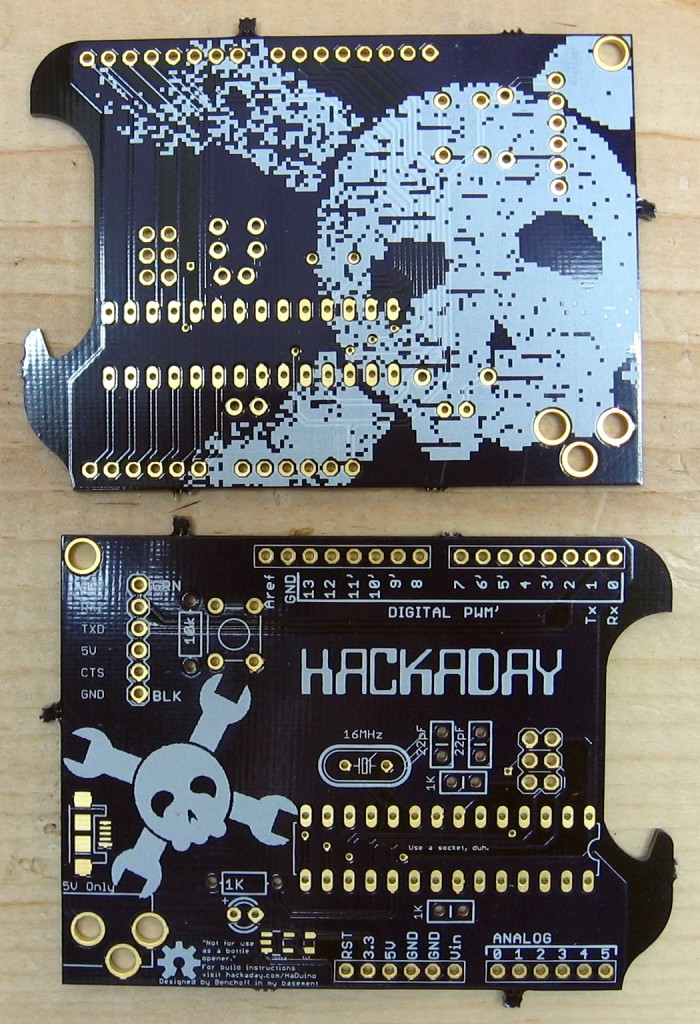
http://hackaday.com/2013/10/11/haduino-open-your-beer-using-arduino/
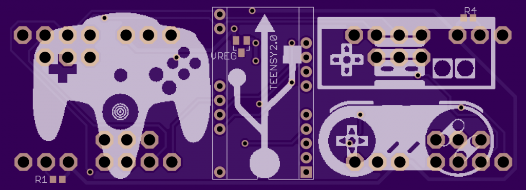
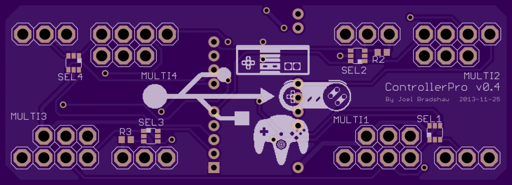
The last board of this post is the ControllerPro. This is by far my favourite board I saw on OSH Park.